
If you manage a team of five or more across several projects, your resource tracker is probably a spreadsheet. It might even be a good one. The formulas work, the columns line up, and overallocations light up red. And it still can’t answer the questions you actually have.
The Spreadsheet Ceiling
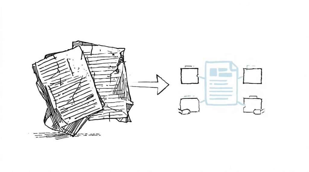
A client of mine builds templates for the project management market. He came to me with two sheets he had used for years: a planned-versus-actual hours tracker and a resource assignment matrix. Both were polished. Both held real data. And both fell apart the moment he needed to look at that data from a different angle.
Here is what spreadsheets do well. They hold a grid: a row per person, a column per day, a number in every cell. That is the whole shape.
Here is what a project manager actually asks:
- Who is free Thursday?
- What is one person working on this month?
- Is the team overallocated next week?
- How much unplanned work did we absorb this month?
- Which projects are eating the most hours?
Every one of these means rearranging the grid, and a grid doesn’t rearrange. It gets filtered, copy-pasted, exported to a pivot table, or more often just ignored until someone asks in a meeting and the answer is “let me get back to you.”
That is the ceiling. Spreadsheets hold data well. They just don’t hand it back in the shape you need.
What Actually Works
Resource management needs three things a spreadsheet can’t offer at the same time:
Fast daily input. People enter hours every day, and nothing kills a system faster than slow entry. A spreadsheet nails this: click, type, done. Any replacement has to match that.
Many angles on the same data. The week, the person, the project, the month. One set of numbers reshaped on demand, rather than four separate tabs.
A source of truth for each person. One place per team member that holds their assignments, their workload, and where they are overbooked.
I rebuilt my client’s two sheets as one connected Notion setup: three databases for hours, assignments, and a per-person dashboard. The input stayed manual, because that is what he wanted and what people are fast at. What changed was the viewing layer. The same numbers could suddenly answer “who is free Thursday” without a single new entry. Filters did the work that copy-paste used to.
What Most People Get Wrong About Replacing Spreadsheets
Two mistakes show up almost every time a team tries this on its own.
They automate the input. Forms, timers, rollups, auto-calculations, and then they wonder why nobody uses it. The slow part was never typing a number. It was reshaping the data by hand. Keep entry fast and fix the output instead.
They rebuild the grid. They recreate the same wide layout in Notion and call it done. Notion can hold a grid, but that is the weakest thing it does. If your Notion system looks like your spreadsheet, you have just built a slower spreadsheet.
The fix for both is the same: split the data into connected databases, keep entry simple, and let the views do the heavy lifting.
The Real Signal to Watch For
You will know you have hit the ceiling long before you admit it. It is the small dread you feel when someone asks a “quick question” about who is free next week, and you already know the honest answer is “give me a minute with the sheet.” That flinch is the moment the grid has stopped serving you. The spreadsheet isn’t broken. The shape is. And the shape is the one thing a spreadsheet can never change.