
excel-to-notion-budget-dashboard

From Excel to a Notion Dashboard

A Fiverr client reached out last month with a specific problem. She’d been tracking her personal budget in Excel for over a year. The spreadsheet worked. The formulas were correct. The categories added up. She just didn’t open it anymore.

When she messaged me, she sent two files. The first was her current Excel file. The second was a rough PNG sketch of what she wished her budget looked like. Dark cards, round charts, progress bars. She didn’t know if Notion could build the dashboard she’d sketched. She asked.

This is the story of what changed between the Excel file and the Notion build, and why she’s still using the dashboard a month later.

What Was Actually Wrong With the Excel File

Her spreadsheet wasn’t broken. Nothing was miscalculated. No data was missing. The issue was different.

Every cell looked the same as every other cell. Rows of numbers, tabs for each month, SUM formulas at the bottom. If she wanted to know how much she’d spent on food this month, she scrolled to the food row, found the total, and read the number. That’s four steps for an answer she should have at a glance.

Worse, each month’s tab had drifted slightly over the year. She’d made small adjustments here and there. By December, no two months had the same layout. Every visit to the sheet required re-orienting, which made the visits shorter, which made them less frequent, which eventually made them stop.

She wasn’t undisciplined. She’d been at it for 14 months. The spreadsheet was asking more of her attention than the information it returned was worth.

What She Wanted Instead

She described what she wanted in simple terms. Clean, not too colorful. Motivating to open each month. “Almost gamified,” in her words. She wanted the dashboard to feel like a fitness tracker, not a ledger.

She also had three concrete requirements: track expenses by category, compare actual vs budget each month, and show yearly trends at a glance.

One detail from her message shaped the build more than anything else. She uses a dedicated virtual credit card for each category. Food has its own card. Subscriptions has its own card. Education has its own card. Which means her total data entry for the whole month is one or two transactions per category. Not dozens. She didn’t need automation. She needed a dashboard that made her want to look at what she’d already entered.

The Structural Shift

The Excel file had one fundamental problem in how it was organized. The data and the interface were the same thing. Every time she opened the file to check her budget, she was also looking at the raw transaction grid.

In the Notion build, I separated the two completely.

All transactions live in a single Transactions database that she almost never sees. The dashboards read from it in the background. What she opens is the monthly dashboard, which displays only the visualizations: the headline metrics, the income vs expenses chart, the category donut, and the per-category progress cards.

This single change, separating the input layer from the view layer, is what turns a spreadsheet into a system.

What Each Month Looks Like

Every monthly dashboard uses the same template. January looks exactly like July. That’s not a design preference, it’s a behavioral one. Muscle memory beats novelty. If she has to re-learn the layout each month, she stops opening it.

The top of each month shows five headline metrics: target income, spend on needs, spend on wants, total used, total saved. These are the numbers she actually cares about answered at a glance.

Below the metrics, a line chart of income vs expenses for the month. Below that, a donut showing where the money went by category. Below that, individual category cards with progress bars that fill as the month goes on.

She said the progress bars are the part she checks most. Watching the grocery bar fill from 40% to 60% over two weeks feels different from reading “$320 of $500 used.” Same information, different relationship.

What the Yearly View Revealed

The yearly view is where the Notion build genuinely outperforms what Excel could do.

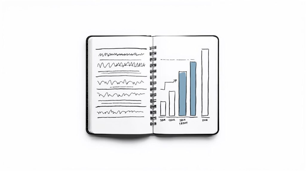
It stacks 20 category charts on one page. Each chart shows the projected budget and actual spending across all 12 months. Two seconds of scanning tells her which categories are consistently over budget, which are consistently under, and which have been quietly eating more than she realized.

She had all this data in Excel. It was already in the spreadsheet. She’d just never been able to see it as a pattern. In the Notion yearly view, the patterns are immediate.

Within the first month of using the new dashboard, she’d already identified that her food budget had been set too low every month of the previous year, her transport budget had been consistently overestimated, and one subscription category was slowly growing in a way she hadn’t noticed. None of this information was new. The presentation was.

Why I Didn’t Add Automation

Most people who ask for a Notion budget dashboard also ask about automation. Bank feeds, Zapier workflows, email parsing to pull transactions automatically.

I didn’t propose any of this for her build, and I advise most clients away from it. The reason is simple. Integrations break. APIs change. When the automation fails, the data stops updating, and within weeks the dashboard is full of stale numbers that no one trusts. At that point, the whole system gets abandoned.

Her virtual-card setup already reduced data entry to a manageable level. Adding automation would have introduced a potential point of failure without reducing her workload meaningfully. Manual entry, done in under a minute per month, is the most reliable version of the system.

This decision wouldn’t apply to every client. Businesses with hundreds of transactions per month need automation. Personal budgets almost never do.

The Visual Decisions

She asked for clean, not too colorful, and motivating. Three specific choices delivered that.

Dark theme instead of light. Light mode reads as spreadsheet work. Dark mode reads as a product.

One accent color for neutral progress, green for positive deltas, soft red for overspend. No rainbow category palette. Clean dashboards feel calmer to open, which means they get opened more often.

Progress bars that fill visually as the month progresses, instead of raw dollar readouts. This is the single choice that she mentioned made the biggest difference in how it felt.

What Changed After Delivery

The dashboard was handed over with a walkthrough Loom. She watched it once and was running the system independently the next day. I haven’t had to intervene since.

The friction concern she raised at the start was the one I tracked most carefully. If the new system took more effort than Excel, she’d drift back to the spreadsheet within weeks. That didn’t happen. She reports opening the dashboard more frequently than she ever opened the Excel file, and her monthly maintenance time has dropped.

The shift wasn’t about Notion being a better tool than Excel. It’s about a dashboard designed to be looked at, versus a spreadsheet designed to be calculated in. Both are valid. Only one gets opened on a Tuesday night in month six.

Is Notion Right for Your Personal Budget?

The honest answer is: only if your current system isn’t getting opened.

If your spreadsheet works and you enjoy using it, there’s no reason to move. Excel is a better tool than Notion for people who genuinely like the grid view.

If you’ve built a budget three times in two years and quietly stopped using each one, the problem isn’t your discipline. It’s the interface. You don’t need a stricter system. You need one that’s easier to look at than to avoid.

That’s the build I did for her, and it’s the build I do for most personal finance clients who come to me with the same story.

Want a dashboard like this for your own finances, your business, or your team? I’ve built 400+ custom Notion workspaces across personal finance, operations, sales, and content.

Leave a Comment

Your email address will not be published. Required fields are marked *

Scroll to Top