The Client
A US based client who had been tracking her personal finances in Excel for over a year. She was still maintaining the sheet but no longer actually using it, and wanted to move to a Notion dashboard that was clean, visually motivating, and easy to maintain long term.
The Problem
Her Excel file worked but felt static and uninspiring. The layout had drifted month to month, making it harder to scan. She checked it infrequently, and when the credit card statement arrived each month, the numbers often surprised her.
She wanted three things: tracking by category, actual vs budget comparison per month, and a yearly view to spot trends. Her main concern was friction. If the new system took more effort than Excel, she would drift back to the spreadsheet within weeks.
What I Built
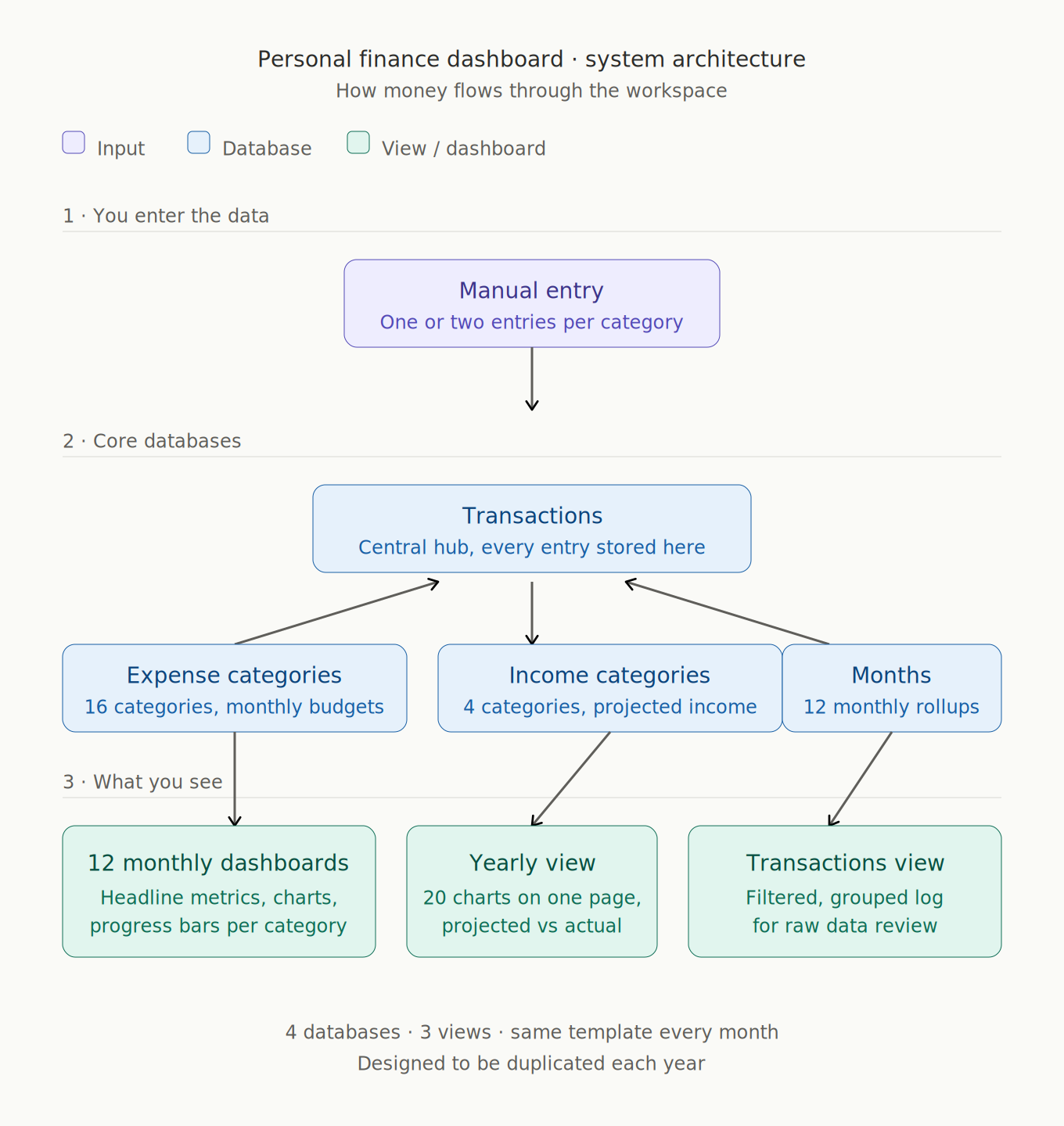
Core Databases
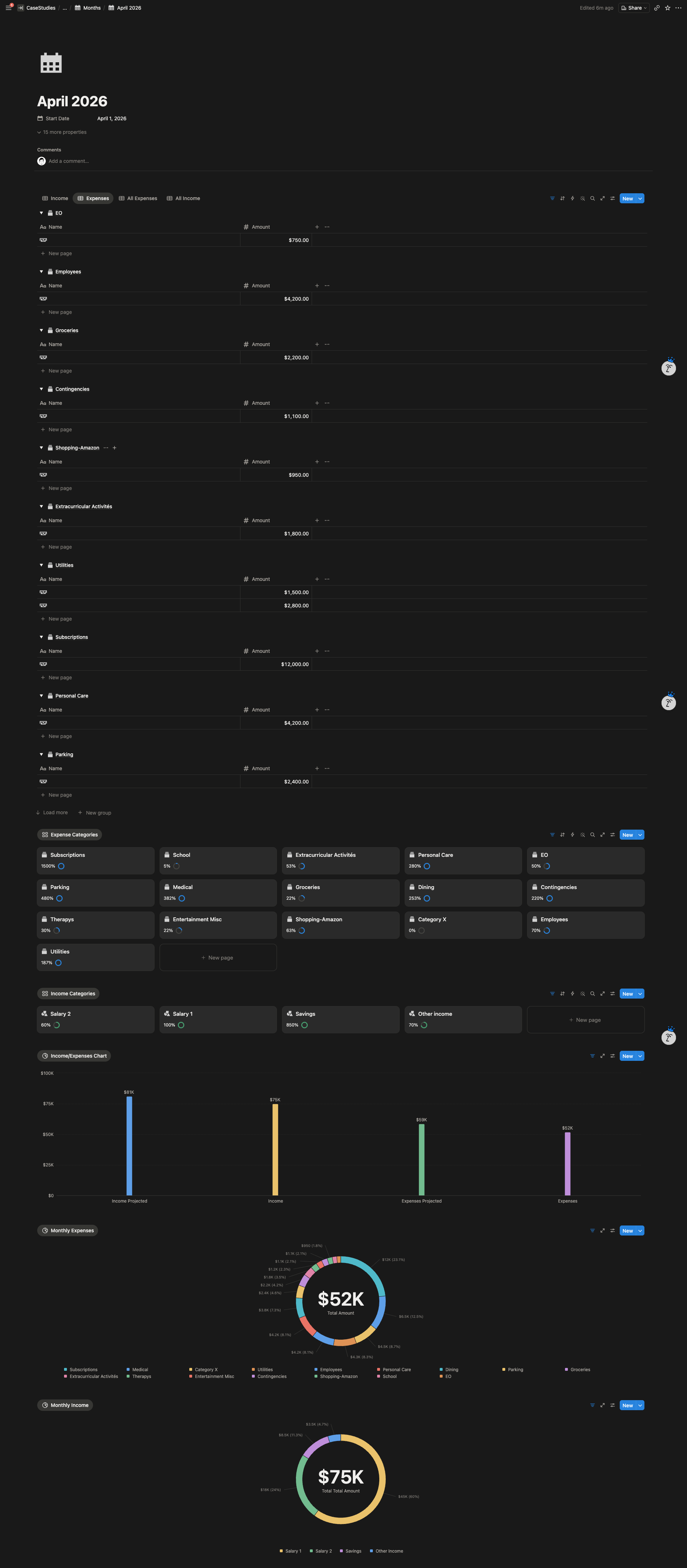
- Transactions Database — every income and expense entry stored once with category, date, amount, and notes. Feeds every view and dashboard in the workspace.
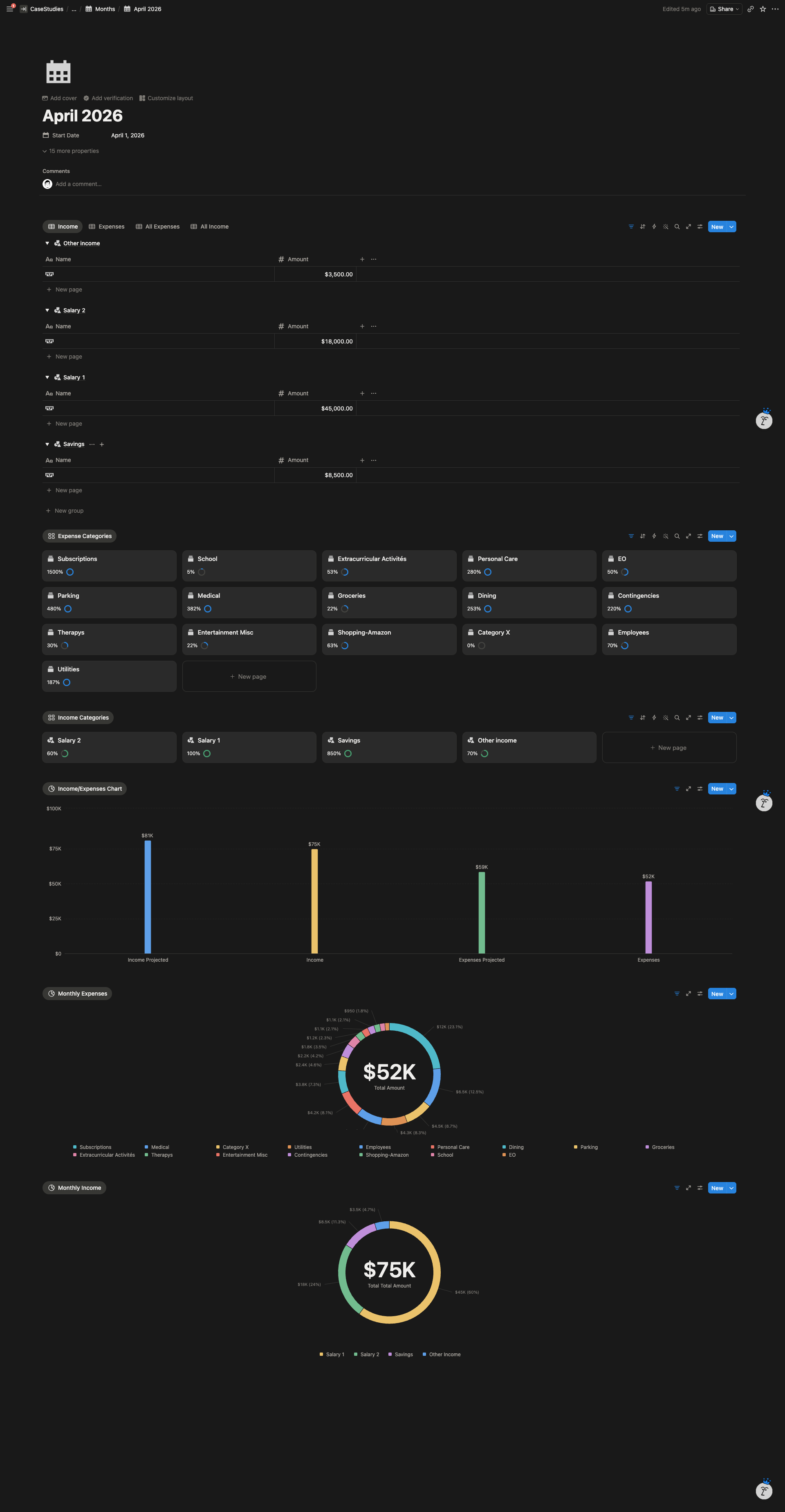
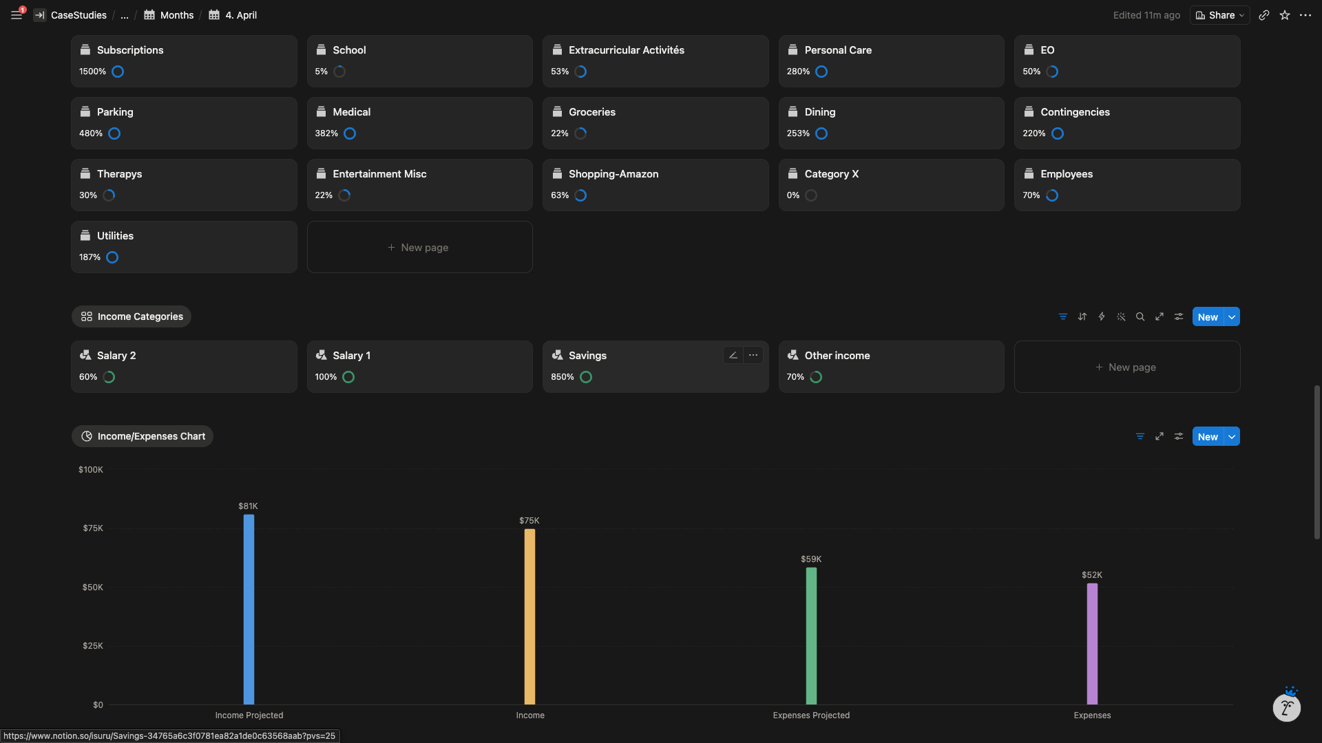
- Expense Categories Database — 16 categories with monthly budget targets and linked transactions. Powers the per category charts and progress tracking.
- Income Categories Database — 4 categories structured the same way as expenses, with projected income per category.
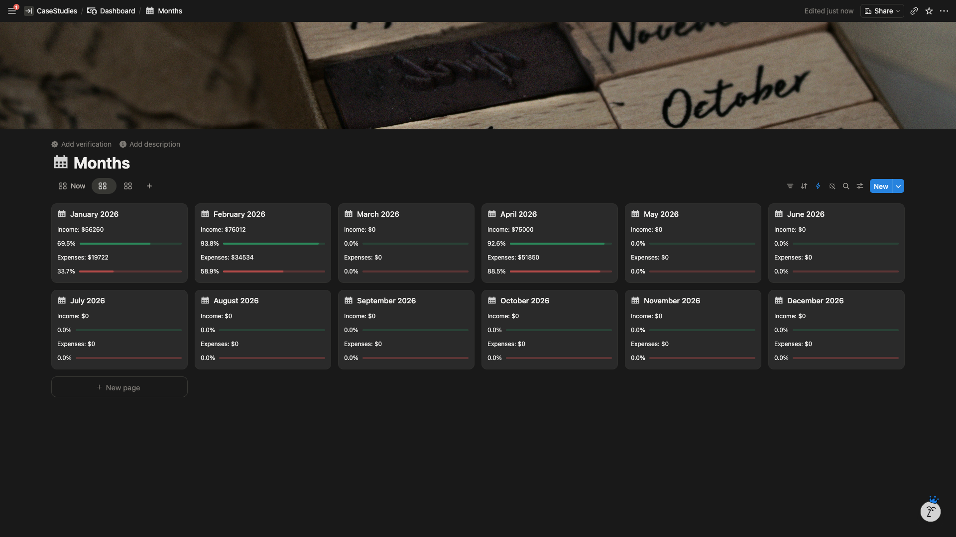
- Months Database — 12 pre built monthly entries, each linked to its transactions and category rollups. Controls the monthly dashboard template.
Dashboards & Views
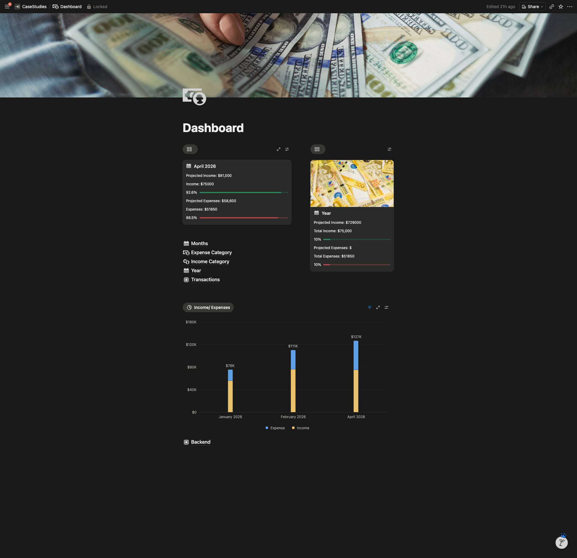
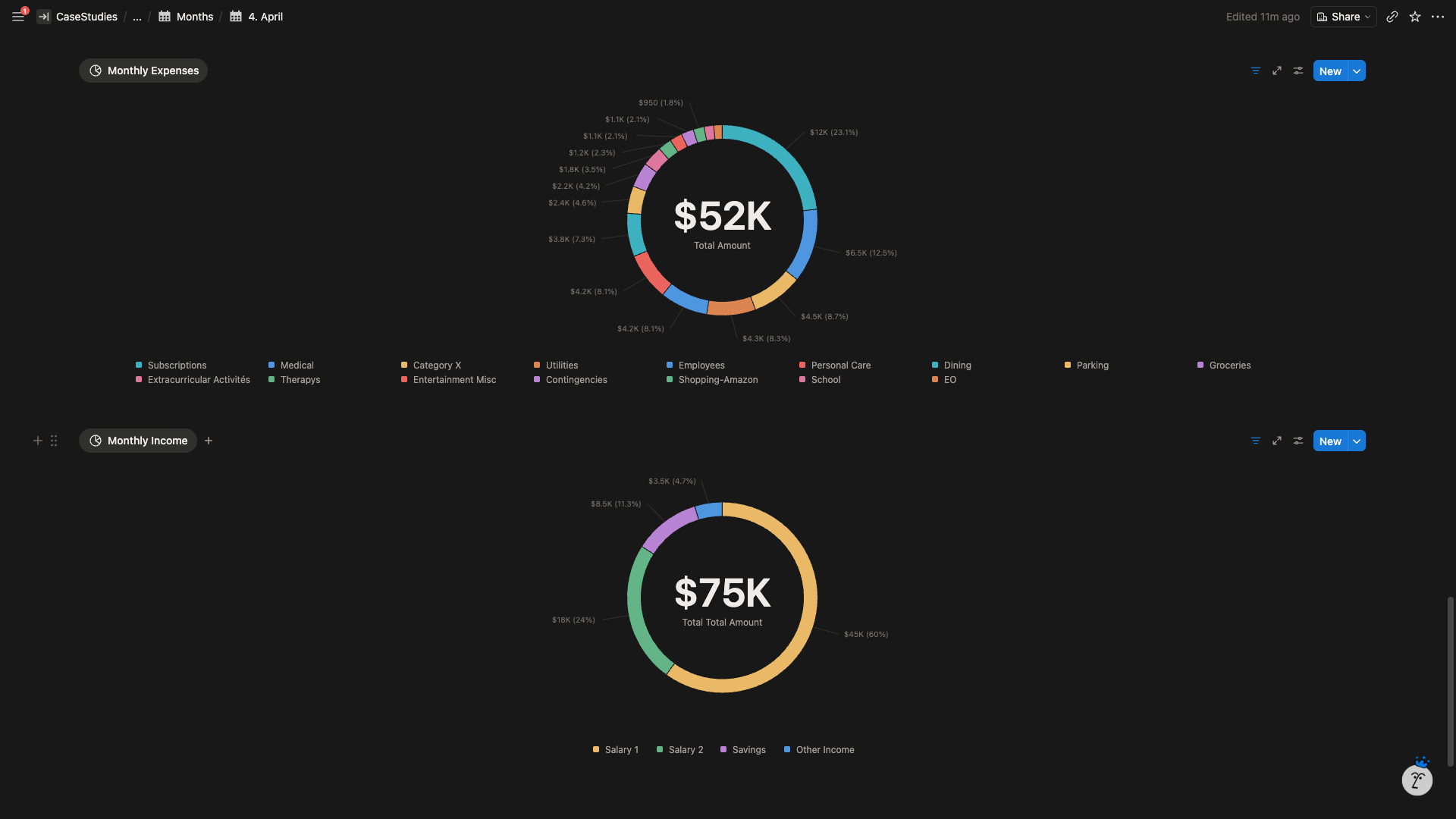
- 12 Monthly Dashboards — identical template across every month. Headline metrics at the top (target income, spend on needs, spend on wants, total used, total saved). Income vs expenses line chart. Category donut chart. Per category progress cards with fill bars showing actual vs budget.
- Yearly View — 20 category charts on a single page (16 expenses, 4 income), each showing projected vs actual performance across all 12 months. Designed for pattern recognition at a glance.
- Transactions View — filtered and grouped log of every entry, used only when the client wants to review raw data.
Design
- Every month uses the same template so her eyes know where each number lives. No re orientation required per visit.
- Dark minimal theme with one accent color for progress, green for positive deltas, soft red for overspend. No rainbow category palette.
- Progress bars fill as the month proceeds, so the dashboard shows where she stands without her having to read numbers.
Data Entry
Manual entry only, by design. The client uses a dedicated virtual credit card per category, which reduces her transactions to one or two entries per category per month. Automation would have introduced failure points without reducing meaningful workload.
Built to Replicate
The entire workspace is designed to be duplicated at the end of each year. New year, new duplicate, budget targets reset, transactions cleared. Year over year archives preserved but out of the active workflow.
System Architecture
The Result
The friction concern she raised at the start did not materialize. The dashboard takes less time to maintain than her Excel file required, and she opens it more often than she ever opened the spreadsheet.
Within the first month, the yearly view revealed category level patterns she had not been able to see in 12 months of Excel tracking, including budgets she had set too low and categories she had been underestimating.