 Isuru
Isuru A client reached out with a straightforward ask. She had been tracking her personal budget in Excel for over a year, and the sheet worked fine. The formulas were right and the numbers added up. She had just stopped opening it.
Along with the message she sent a rough draft of the layout she had in mind: spending tracked by category, actual against budget each month, and some view of how the year was trending. What she wanted was a version of her budget clear enough to actually look at, and low maintenance enough that she would not slide back to the spreadsheet.
The Challenge
The Excel file was really a ledger, and the client wanted a dashboard. The data was accurate but static. To see how much was left in a category, she had to open the right tab, find the row, and read the number off it.
It had also drifted over the year. Small tweaks to each month’s tab meant no two months had quite the same layout, so every visit began with reorienting herself. By the time the credit card statement arrived, the total was usually a surprise, not because the numbers were wrong, but because she had not been able to see them coming. The one firm constraint was blunt: if the new system took more effort than Excel, she would be back in the spreadsheet within weeks.
The Approach
The core decision was to separate the data from the view. In the Excel file the two were the same thing, so every glance at the budget meant staring at the raw ledger. In Notion I split them apart: all the numbers would live in databases the client rarely had to touch, and on top of them I would build dashboards whose only job was to be read at a glance.
Before building anything, I walked her through the plan so she could see exactly what she was getting and sign off on it. Only once she was happy with the layout did I start building.
The Build
The whole thing is built to be easy to keep up. She logs each expense once, in a few seconds from her phone, and everything else updates on its own. There are no formulas to maintain and no totals to copy between tabs, the numbers just flow straight into the dashboard.
Every month opens to the same clean view: what she planned to spend, what she has actually spent, and a progress bar for each category that fills as the month goes on. There is nothing to rebuild and nothing to relearn, she just opens it and sees where she stands.
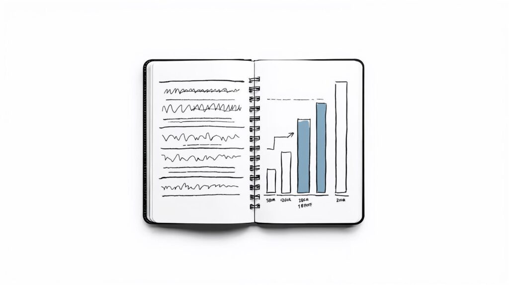
And across the year it fills into a single page that shows how every category is trending, so twelve months of spending finally reads as a clear picture instead of a wall of cells.
The Result
The system did what the client asked. Monthly upkeep now takes less time than it did in Excel, and she opens the dashboard far more often than she ever opened the sheet.
The yearly view did something the spreadsheet never managed: it turned twelve months of scattered numbers into trends the client could read at a glance, so setting the next year’s budgets became a quick decision instead of guesswork. Handoff was a single walkthrough video, and the client was running it on her own after that.
What I Learned
The lesson had little to do with Notion being better than Excel. A spreadsheet is built for doing the math, and a dashboard is built for being read. The client already had accurate numbers; what she was missing was a simple way to see them. Once the version she owned was the easy one to look at, it became the one she actually opened.