A poker player in Australia came to me with a Notion system he had built himself. He had spotted something real: most players at lower stakes study in a scattered way, with no structure to it at all. So he put together his own fix, a workspace with weekly study plans, a way to log sessions, a progress tracker, and a starter roadmap for beginners. The thinking behind it was genuinely good.
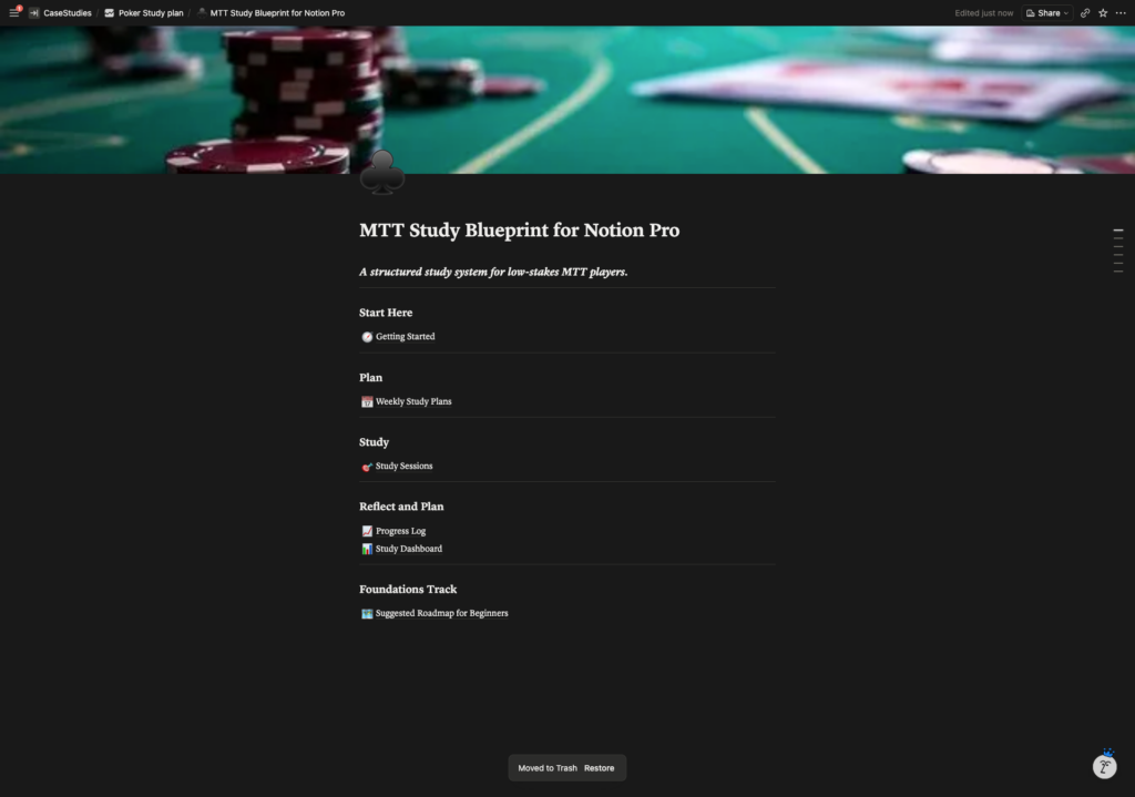
The trouble was that it didn’t look like anything you would pay for. He wanted to sell it, but what he actually had was a personal workspace: a plain list of page links on a white background, databases that read like bare spreadsheets, and no real sense of progress or of where to begin. Open it as a first-time buyer and you would be lost inside a minute. Strong content, weak packaging.
What he really wanted to know was whether Notion could even carry the kind of polish he had in mind, or whether the tool itself would hold him back. My take was that Notion wasn’t the ceiling. But polish doesn’t come from a nicer colour scheme on its own. It comes from how a thing is built, how it guides someone the first time they open it, and how clearly it shows them getting better. That became the plan.
Building the Engine First
Before touching how it looked, I rebuilt what was underneath. The loose collection of pages became three connected databases: weekly plans, study sessions, and a library of decisions. Every session ties back to the week it belongs to, and the decisions build up over time, so a user can actually watch their confidence in a given spot grow instead of journalling once and forgetting it. That single change turned a static notebook into something with a feedback loop, which is the part that makes a study tool feel alive.
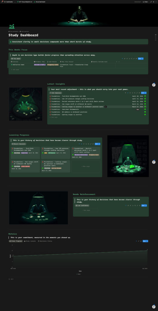
On top of that I added dashboards, built from Notion’s own charts, that show the things a learner cares about: how many sessions they are getting in, whether their study is keeping pace with the target they set, and which areas are solid versus still shaky. Progress you can see is a big part of why someone will happily pay for a tool. When you can watch yourself improving, it stops feeling like a spreadsheet and starts feeling like it is working for you.
I also wanted the system to be kind to a brand-new user, because nothing kills a template faster than opening it to a blank page. So I built in guided roadmaps that load on demand: a beginner can drop in a whole month of pre-filled weekly plans with a single click, choosing how much hand-holding they want, without disturbing anything they have already set up for themselves.
Before
Making It Feel Like a Product
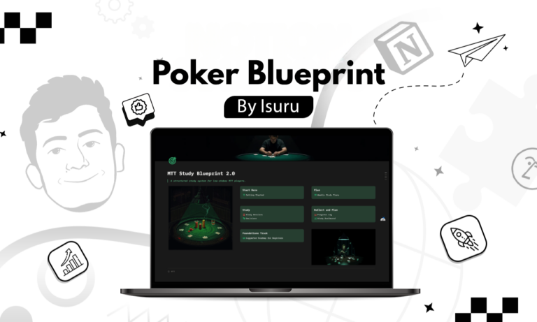
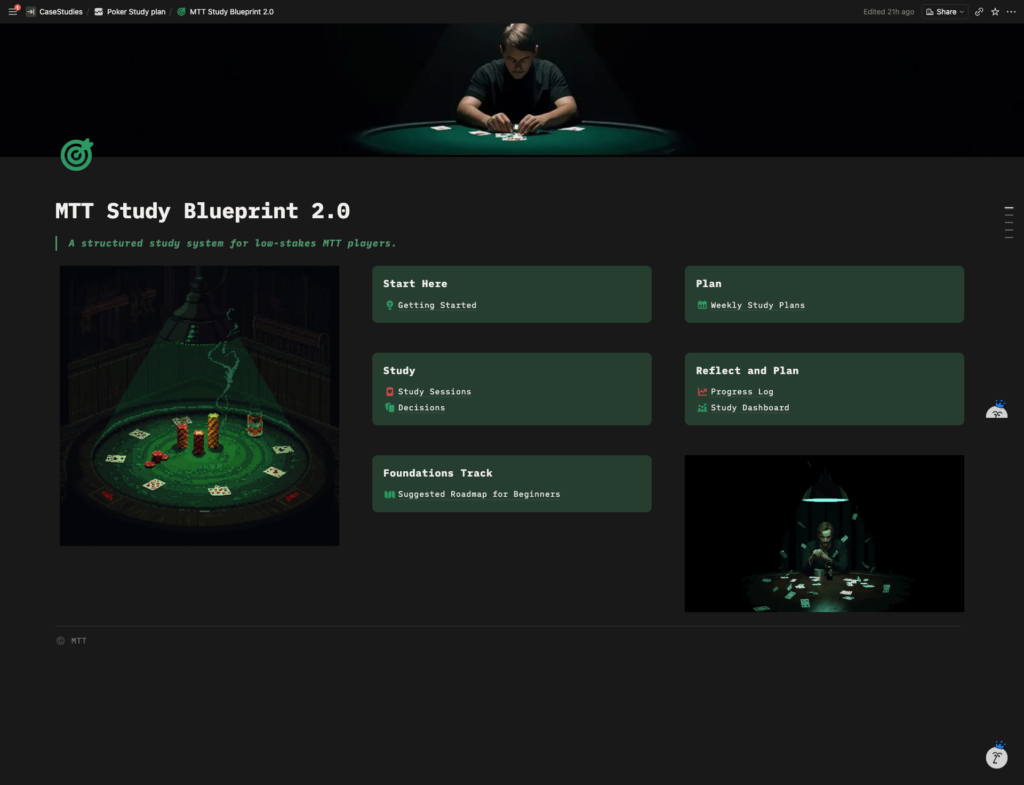
Then came the part he was least sure Notion could pull off. He wanted it clean, premium, and dark, with a poker feel to it. I turned the homepage from a list of links into a proper dashboard of navigation cards, carried a dark theme through the whole thing, and added some poker-themed pixel art as accents. Where it made sense, plain database tables became gallery views that actually look designed. The goal was for someone to open it and feel like they had just launched a real app, rather than wandered into somebody’s private notes.
After
What Actually Moved the Value
Looking back, the thing that turned this from a tidy workspace into a sellable product wasn’t any one feature. It was treating it like a product from the start rather than a document. We got clear on exactly who the user was before building anything. We proved the engine worked before spending a minute on how it looked. And he even stopped to test the idea with real players before paying for the final polish. The design mattered, but it landed because every decision was made for the person opening it for the very first time.
That is really what people are asking when they wonder whether Notion can feel premium. It can. The trick is to build for the person on the other side of the screen, and then let the polish carry a system that already earns its place.