Most people track a personal budget in a spreadsheet. It works, technically. The formulas run and the totals add up. But somewhere around month three, the file stops getting opened.
That was where a client of mine had landed. She had built her own budget in Excel and kept it going for more than a year, and she was tired of it. With her first message she sent two things: her Excel file, and a rough sketch of what she wished her budget looked like, all dark cards, round charts, and progress bars. She wanted to know if Notion could give her the same numbers in something she would actually enjoy opening.
This is how I built it, and why I made the choices I did.
What She Actually Needed
Before designing anything, I got clear on what the dashboard had to do:
- Track spending by category
- Compare actual spending against a budget each month
- Show the whole year at a glance
- Feel clean rather than colorful, and be motivating to open
- In her words, feel “almost gamified”
One detail shaped everything: she uses a separate virtual card for each spending category, so there are only one or two transactions per category each month. This was never a high-volume data problem. It was a low-volume one that needed to look and feel good.
How I Scoped It Before Building
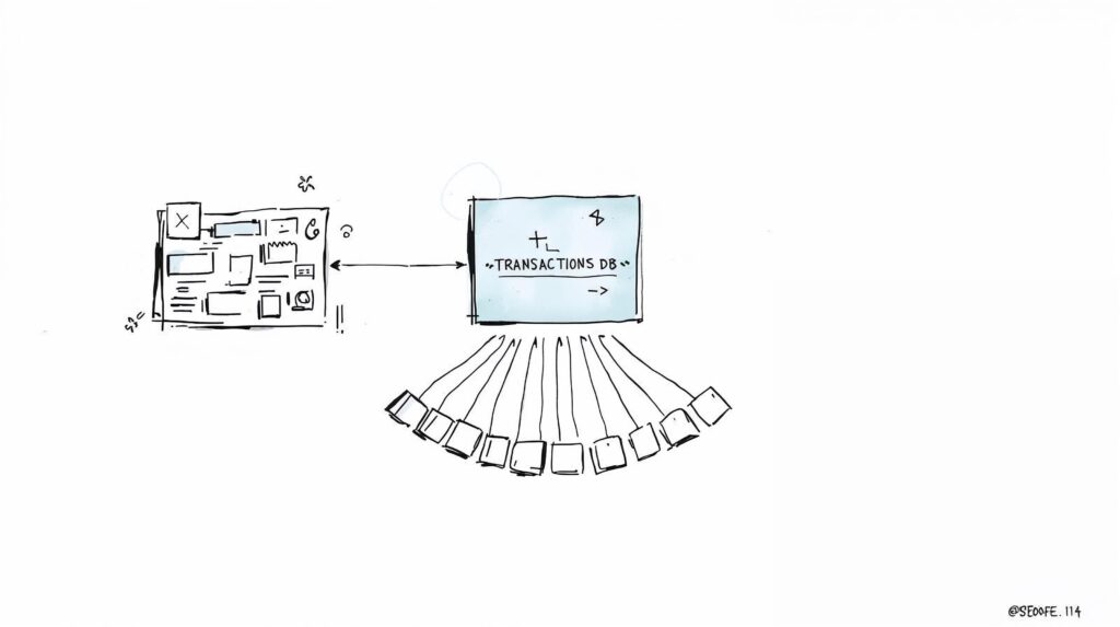
I didn’t open Notion first. I recorded two short walkthroughs and shared a simple diagram of how the pieces would connect.
The first walkthrough covered the structure: one central place for every transaction, feeding monthly dashboards built from a single repeatable template, with a yearly view that adds itself up automatically. Only once she had approved the second walkthrough did I start building. It’s how I work, so clients have already seen what they’re getting, twice, before it exists.
The Build
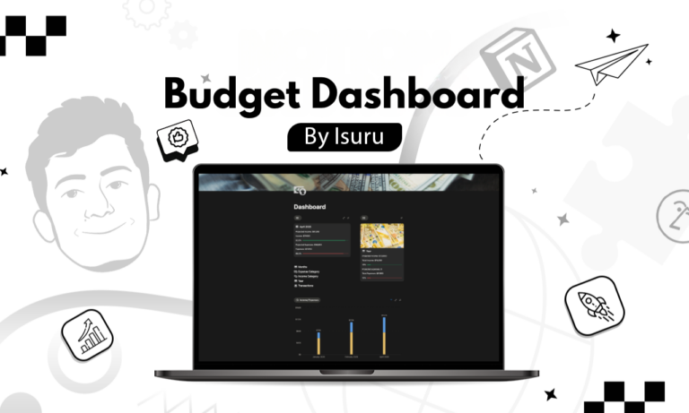
The core is simple. Every income and expense goes into one place, tagged with a category, date, and amount. Each category carries its own monthly budget, so it can be compared against what actually happened.
From there, each month gets its own dashboard, all built from the same template. The top shows the headline numbers for the month. Below that sits a chart comparing income against expenses, and a card for each category with a progress bar that fills as the month goes on.
The yearly view is the part she makes decisions from: one chart per category comparing planned against actual across all twelve months, so next year’s budget is based on what really happened this year.
Why Every Month Looks the Same
Her old Excel file had drifted. She had tweaked the layout month by month, and by December no two tabs matched. That inconsistency was part of why she stopped opening it.
In the Notion build, January looks exactly like July. Once she knew where to look, checking her budget went from a ten-minute chore to a twenty-second glance. Familiarity is worth more than variety here.
Designing for “Almost Gamified”
Her wish for it to feel “almost gamified” drove three choices:
- Progress bars on every category that fill through the month, so she can see where she stands at a glance.
- A dark, minimal theme. Light mode feels like spreadsheet work; dark felt like a product she wanted to open.
- Green for a good month and a soft red for overspend, so a strong month shows instantly.
No rainbow of colors. One accent, and everything else has to earn its place.
Why I Skipped the Automation
I could have suggested a bank connection or an automation to pull transactions in. I didn’t, because she didn’t need it. With one or two entries per category, adding a whole month of data takes under a minute. Automations are also the first thing to quietly break in a budget system, and a system that breaks is one you stop trusting. Simple manual entry, done in seconds, was the more reliable choice.
Built to Run Again Next Year
At the end of the year she copies the workspace, resets the targets, and clears the transactions to start fresh, while the past year’s data stays archived. Nothing gets rebuilt from scratch.
The Outcome
The worry she raised at the start, that a new system would be more effort, never happened. The dashboard takes less time to keep up than her spreadsheet did, and she opens it far more often. The change wasn’t better math. It was a budget she actually wants to look at.