
 Isuru
Isuru A project manager came to me with a clear goal. He builds Notion templates for the PM market, and his next product was going to be a resource management template. He already had two Google Sheets that worked: a planned-versus-actual hours tracker and a resource assignment matrix. He wanted both rebuilt in Notion as one connected system he could sell.
The brief sounded simple. The work wasn’t, because the reason those sheets worked was also the reason they couldn’t grow.
The Challenge
The hours sheet was one wide grid. Four weeks of dates across the top, a P and an A column under each date, every team member down the side, and hours typed into every cell. Underneath sat the totals: planned work, unplanned work, project utilization, team utilization, all worked out by hand.
The assignment sheet was a different kind of pain. Checkboxes in a five-day grid showed which days each person was on which project. To see next week, you copied the whole block and changed the dates. To find out who was free on Thursday, you scanned every row.
Both sheets held the data a PM needs. What neither could do was answer the follow-up question: who is free, who is overloaded, what is this one person actually doing this month. A grid shows one angle at a time, and resource questions are always about several angles at once.
What I Built
Four decisions shaped the whole system.
Keep the input manual. The client was clear that a PM typing in hours is normal and fine, so I left that habit alone. There was no reason to automate something the user was happy to do, and automating it would only have added friction.
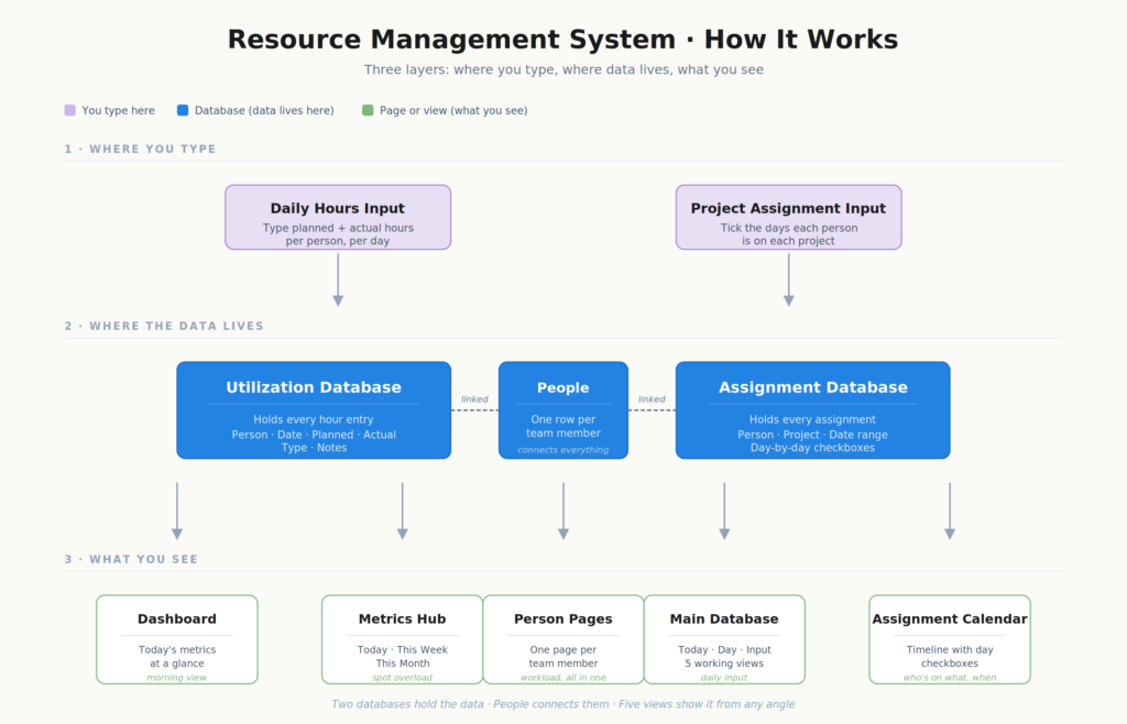
Split one sheet into two databases. Hours and assignments are two different jobs that the spreadsheet had jammed into one grid. In Notion they became two connected databases, each with the views it actually needs.
Give every person their own dashboard. This was the piece that unlocked the rest. In the sheets there was no clean way to ask what a given person is doing right now. I built a reusable dashboard, one page per team member, that pulls in every hours entry and every assignment tied to that person. When a new hire joins, their dashboard is created from that template and their full workload is there with no extra setup.
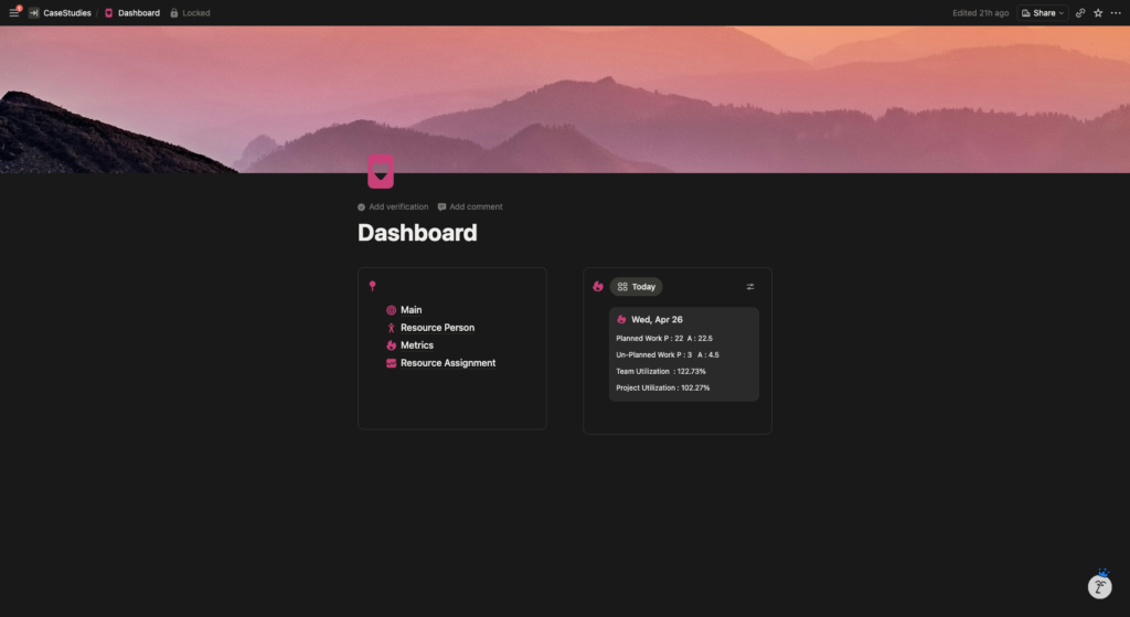
Make the home page a morning glance. A PM opening a resource tracker doesn’t want to land on a database. They want an answer to one question: is today okay? The main dashboard keeps navigation on the left and a live today card on the right, showing planned versus actual hours, unplanned work, team utilization, and project utilization. The first few seconds of the morning tell them whether the day is on track.
Around those calls, the details fell into place. The hours database is grouped by work type, so billable project work and internal overhead stay visually separate, and five views cover every input and review situation, with the input view filtered to today so the PM isn’t hunting for the right row. A metrics hub rolls the same numbers into Today, This Week, and This Month cards, and any day above 100% utilization flags an overload on its own.
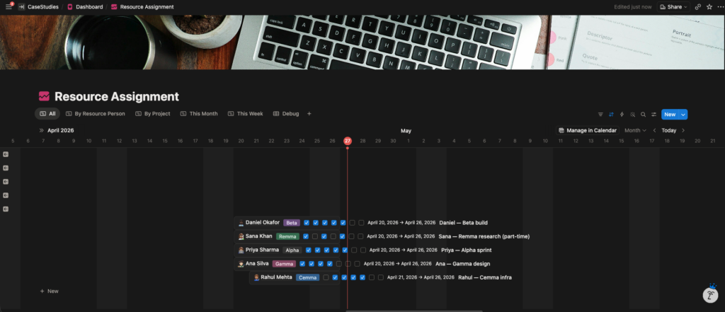
The assignment board was the trickiest call. The client wanted to keep the familiar five-day checkbox layout, because that is how PMs read assignments at a glance. So I kept the checkboxes but placed them on a live calendar timeline. Each assignment is one person on one project across a date range, with day-level checkboxes sitting on the real calendar, and five views (All, By Resource Person, By Project, This Week, This Month) slice it any way he needs. Scroll sideways to move through the months, with no copy-paste.
The Result
He ended up with a template that does everything the spreadsheets did and then answers the questions they never could. The input is still manual, on purpose. But the data is finally sliceable: a PM running a 20-person team can see individual workloads, project assignments, weekly utilization, and monthly trends without rebuilding a single grid. And because it is one clean, duplicatable template, it is ready to sell to his market.